P&L TRACKER
One Energy believes that, in the customer-centric grid of the future, financial data will be available to everyone.
We are sharing ours freely. We challenge others to do the same.
Welcome to the One Energy P&L Tracker. One Energy strives to be as transparent as possible. This page shows something few other renewable energy companies or large-scale power producers dare to share freely. Available below is production data for One Energy’s projects, pre-construction estimates, and variables created to validate those estimates. These variables provide an analysis of One Energy’s projects. Some combinations of variables are less meaningful when displayed together, therefore, this page contains graphs of the most meaningful combinations of variables.
What’s on this Page?
Description of Terms:
One Energy’s project financial information comes from One Energy’s Financial Model. This model uses a series of formulas and industry knowledge to project how a project will perform over the course of its lifetime. The Financial Model also allows the input of actual financial information from monthly income statements and customer invoices to show a side-by-side comparison of projected vs. actual financials. The variables selected for the visualizations below best represent the performance of One Energy’s operating projects.
VARIABLES
- Actual Revenue
- Actual Expense
- Actual Net Cash
- Projected Revenue
- Projected Expenses
- Projected Net Cash
- Revenue Over/Under %
- Expenses Over/Under %
- Net Cash Over/Under %
Financial information for Revenue comes from monthly invoices sent to the customer. Information on project expenses comes from monthly income statements. The Net Cash is the difference between Revenue and Expenses.
How to Use the Graphs:
This page contains graphs that have been created in Tableau. This section clarifies how to use these graphs.
There are four filters for the data: projects, variables, years, and data resolution. The checkboxes below allow the user to filter the graphs to view a combination of projects, variables, or years. The data resolution on the graphs lets the user choose to view the data as monthly, quarterly, or yearly.
Each graph also has two buttons located at the bottom of the graphs. The first button allows the user to download a PDF version of the graph. The second button allows the user to download the data used to create the graph as a Microsoft Excel spreadsheet. The rows of the spreadsheet correspond to the variable currently displayed on the graph and the columns in the spreadsheet correspond to the dates. To download a PDF version of all graphs together, use the View Full Report button to open a pop-up containing the combined dashboard and click the Download Full Report PDF button.
The graphs display variables as a sum of the projects selected for that time period. For example, if Ball 1.0, Ball 2.0, and Actual Revenue are selected, the graph will show the sum of the actual revenue for the Ball 1.0 and Ball 2.0 projects.
Graphs:
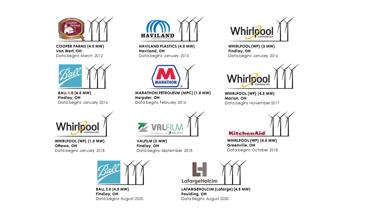
This section shows three graphs comparing Actual and Projected financial information for each of One Energy’s REA projects.
The first graph compares the projects actual vs. projected financials. Depending on which variables are selected the user can view a comparison of one or more project’s revenue, expenses, and net cash. The corresponding bar graph on to the right shows the projected vs actual percentages. When looking at the percentages, values closer to zero are desirable. A value of zero would correspond to the actual revenue being exactly equal to the projected revenue.
The second graph shows specific project comparisons in the form of a bar and gantt graph. This graph is intended to further break down the graph above to show differences in performance between each project. The bars display the actual financials where the gantt lines (smaller horizontal lines) display the projected financials.
Each graph is also able to be filtered by dates. Note that when using a monthly date parameter, the data range may need to be decreased in order to display a less noisy graph. It is recommended to only look at a max of two quarters when using a monthly data parameter.
